Colour Ways and Anodising

Anodising
Anodising is an electrical chemical dye process that penetrates the surface of aluminium. Anodic “coatings” typically range from 0.2 to 0.7 mils in thickness (a mill is one one-thousandths of an inch, so 0.2 mils = 0.0002 inches). Hard anodising (also called military anodising) can produce coatings of up to 2 mils thick. Regular anodising, though primarily cosmetic, helps seal the Aluminium (when you rub an anodised aluminium surface there is no residue – unless you rub through the anodising). Hard anodising provides a degree of surface hardness and scratch resistance over regular anodising.

Ball Burnished
GT pioneered the process of full burnishing mountain bike frames for a highly attractive, long-lasting “raw” aluminium look. The frames are tumbled in special tanks filled with tens of thousands of steel balls and a special solution. After several hours of these balls “burnishing” against the surface of the aluminium, lasting lustre is produced. No finish coating is required after ball burnishing.
Iconic Paint
During the late 1980s and throughout the 1990s, GT Bicycles became renowned not only for their innovative designs and high-performance mountain bikes but also for their bold and distinctive paint schemes. These vibrant designs captured the spirit of the era, making GT bikes stand out on trails and racecourses around the world. From the striking black and white stripes of Daktari to the fiery gradients of Inferno and the warm, glowing hues of Tequila Sunrise, each paint scheme was a statement of style and identity. In this section, we delve into the most memorable and influential paint schemes that defined GT’s mountain bikes during this golden age.

Tequila Sunrise
The Tequila Sunrise paint scheme is one of the most memorable and visually striking designs that GT Bicycles ever produced. It was particularly popular in the 1990s and has since become a symbol of that era, beloved by collectors and enthusiasts for its vibrant, gradient colors that evoke the feeling of a warm, tropical sunset. Here’s a detailed overview of the Tequila Sunrise paint scheme:
- Introduction: Early to mid-1990s (around 1993-1995)
- Design Inspiration: The Tequila Sunrise paint scheme takes its name from the popular cocktail, known for its vibrant layers of color that resemble a sunrise. The design was intended to capture the same warmth, energy, and gradient transition of colors, creating a visual effect that was both eye-catching and unique. This scheme was part of GT’s broader strategy to offer bikes that were not only high-performing but also visually distinctive.
- Appearance:
- Primary Colors: The Tequila Sunrise scheme is characterized by a gradient blend of warm colors, typically starting with a deep red or orange at the top of the frame and transitioning smoothly into yellow or a light golden hue towards the bottom. The colors were meant to mimic the hues of a sunrise, creating a warm, inviting appearance that stood out from the more common solid or metallic finishes of the time.
- Gradient Effect: The key feature of the Tequila Sunrise paint scheme is the smooth gradient transition between colors. This effect was carefully applied to create a seamless blend, giving the bike a dynamic and fluid appearance, as if it were glowing with the light of an early morning sun.
- GT Logos and Branding: The GT logos and other branding elements were typically applied in contrasting colors, often in black or white, to ensure they stood out against the vibrant background. The placement of the logos was designed to complement the gradient, often positioned where the color transitions were most noticeable.
- Market Impact and Legacy:
- Cultural Impact: The Tequila Sunrise paint scheme quickly became one of the most recognizable designs in GT’s lineup during the 1990s. Its vibrant, warm colors were a stark contrast to the more subdued tones that dominated the market, making it an instant hit among riders who wanted to stand out. The scheme also resonated with the laid-back, adventurous spirit of mountain biking, evoking the idea of early morning rides and the freedom of the open trail.
- Collector’s Item: Today, bikes with the Tequila Sunrise paint scheme are highly sought after by collectors and fans of vintage mountain bikes. The combination of its unique aesthetic and the quality of the GT models it was applied to makes it a prized possession in the retro cycling community. The paint scheme is often celebrated as one of the best examples of 1990s mountain bike design.
- Enduring Popularity: Even years after its original release, the Tequila Sunrise paint scheme continues to inspire nostalgia among those who remember the golden age of mountain biking in the 1990s. It remains a beloved design that captures the essence of that era’s style and innovation.
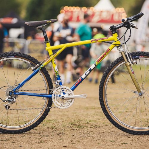
Team Scream
- Introduction: Early 1990s (around 1993)
- Design Inspiration: The Team Scream paint scheme was inspired by the need to create a bold, eye-catching design that would stand out in the fast-paced, highly competitive world of professional mountain biking and BMX racing. The design was intended to reflect speed, energy, and aggression—qualities that GT’s racing teams embodied. The paint scheme was often associated with GT’s factory race teams, which further cemented its status as a symbol of high performance.
- Appearance:
- Primary Colours: The Team Scream paint scheme is characterised by its use of bright, contrasting colours—typically blue, yellow, and black. The most recognized version features a blue base with jagged, lightning-like streaks of yellow and black running across the frame. The colors were vibrant and designed to pop, ensuring that GT bikes would be unmistakable on the race track or trail.
- Pattern: The design featured sharp, angular lines that gave the impression of motion and speed, even when the bike was stationary. These lines often intersected and overlapped, creating a dynamic and aggressive visual effect that mirrored the intensity of racing.
- GT Logos and Branding: The GT logo and other branding elements were usually prominently displayed in white or contrasting colors, ensuring they stood out against the vivid background. This not only reinforced the brand identity but also made the bikes highly recognisable.
- Market Impact and Legacy:
- Racing Pedigree: The Team Scream paint scheme became strongly associated with GT’s factory racing teams, including some of the most successful riders of the era, like Mike King, Nico Vouilloz, and Brian Lopes. The scheme was often seen at the forefront of major racing events, from the UCI World Championships to the World Cup circuit. This association with top-level racing added to the scheme’s prestige and desirability.
- Brand Recognition: The Team Scream design played a significant role in GT’s branding during the 1990s. The aggressive, high-energy look of the bikes matched the brand’s image as a leader in performance cycling, and it helped GT stand out in a crowded market. The scheme was so iconic that it became one of the most recognizable aspects of the GT brand.
- Collectibility: Today, bikes featuring the Team Scream paint scheme are highly sought after by collectors and enthusiasts. The combination of the scheme’s aesthetic appeal and its association with GT’s golden era of racing makes these bikes particularly valuable in the vintage and retro cycling communities.
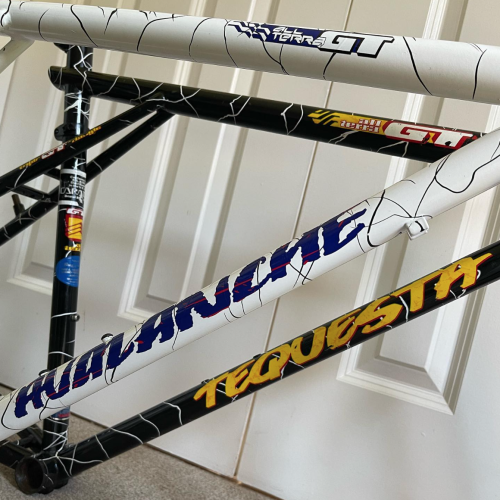
Daktari White & Black
The Daktari White & Black paint scheme was one of the distinctive and eye-catching designs used by GT Bicycles during the late 1980s and early 1990s. This paint scheme was inspired by the appearance of a zebra, featuring bold, alternating black and white stripes, and was part of GT’s efforts to create visually striking and memorable bikes.
- Introduction: Late 1980s (around 1988-1989)
- Design Inspiration: The name “Daktari” comes from the Swahili word for “doctor,” but it was also popularized by the American television series “Daktari” (1966-1969), which was set in Africa and featured many wild animals, including zebras. The paint scheme likely drew inspiration from this cultural reference, as well as the natural pattern of zebra stripes, which is instantly recognizable.
- Appearance:
- Primary Colors: The paint scheme featured a white base color with bold black stripes, mimicking the pattern of a zebra’s coat. The stripes were not uniform, giving the frame a wild and organic look, as opposed to the clean, geometric patterns seen on many other bikes.
- Application: This pattern was typically applied to the entire frame, including the fork, giving the bike a cohesive and striking appearance. The black and white stripes were often irregular, further enhancing the “wild” aesthetic that GT was aiming for.
- Market Impact and Legacy:
- The Daktari White & Black paint scheme stood out in a market that was increasingly filled with bright, neon colors and more traditional bike designs. The zebra-stripe pattern gave the bikes a unique, almost rebellious look that appealed to riders who wanted something different from the standard offerings.
- Today, bikes with the Daktari paint scheme are considered collectible, especially among fans of vintage GT mountain bikes. The striking design, combined with the iconic models it was applied to, makes these bikes particularly desirable in the retro and vintage cycling community.

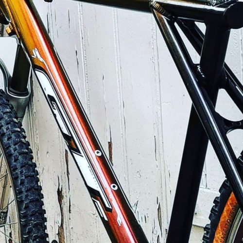
Inferno
The Inferno paint scheme is another bold and memorable design from GT Bicycles, introduced during the 1990s. Known for its fiery, intense color palette, the Inferno scheme was designed to make a strong visual impact, reflecting the high energy and aggressive performance of the bikes it adorned. Here’s a detailed look at the Inferno paint scheme:
- Introduction: Mid-1990s (around 1994-1996)
- Design Inspiration: The Inferno paint scheme was inspired by the imagery of fire and heat, capturing the intense, dynamic energy associated with high-performance mountain biking. The design aimed to evoke a sense of power, speed, and raw energy, mirroring the aggressive nature of GT’s top-tier bikes.
- Appearance:
- Primary Colors: The Inferno paint scheme features a gradient of fiery colors, starting with deep reds and oranges at the top of the frame, blending into bright yellows towards the bottom. This color transition is meant to resemble the glowing embers and flames of a fire, giving the bike a striking, high-energy look.
- Gradient Effect: Much like the Tequila Sunrise scheme, the Inferno design uses a smooth gradient to transition between colors. However, the Inferno’s gradient is more intense, with the colours designed to mimic the look of flames or molten lava, creating a sense of movement and heat.
- GT Logos and Branding: The GT logos and other branding elements on the Inferno scheme were typically applied in contrasting colours, often black or white, to ensure they stood out against the vibrant, fiery background. The placement of these logos was carefully chosen to enhance the overall visual impact of the paint scheme.
- Market Impact and Legacy:
- Cultural Impact: The Inferno paint scheme became one of the most distinctive and talked-about designs in GT’s 1990s lineup. Its fiery, aggressive appearance made it popular among riders who wanted to make a bold statement on the trail or at the race track. The scheme’s intense colors and dynamic gradient captured the spirit of competitive mountain biking during the 1990s.
- Collector’s Item: Like the Tequila Sunrise scheme, the Inferno paint scheme has become highly collectible among vintage mountain bike enthusiasts. The combination of its striking visual appeal and the high-performance models it was applied to makes it a sought-after design in the retro cycling community.
- Enduring Popularity: The Inferno paint scheme continues to be celebrated for its unique and intense design. It remains a favourite among those who appreciate the bold aesthetics of 1990s mountain bikes and the innovative approach GT took with its visual designs.

Midnight Aurora
The Midnight Aurora paint scheme is another striking and memorable design from GT Bicycles, known for its deep, atmospheric colours and subtle gradient effects. This paint scheme, introduced in the 1990s, evokes the mysterious and captivating beauty of a night sky lit by the aurora borealis. Here’s a detailed overview of the Midnight Aurora paint scheme:
- Introduction: Mid-1990s
- Design Inspiration: The Midnight Aurora paint scheme was inspired by the natural phenomenon of the aurora borealis, often seen in the polar regions. This natural light display, combined with the dark tones of a night sky, influenced the design’s deep, rich colours and subtle, glowing gradient. The goal was to capture the beauty and mystery of these natural lights, blending it with the high-performance reputation of GT’s mountain bikes.
- Appearance:
- Primary Colors: The Midnight Aurora paint scheme features a rich gradient of deep purples, blues, and blacks. The colours are meant to represent the dark, inky tones of a midnight sky, with hints of lighter, more vibrant hues to suggest the glow of an aurora. The result is a paint scheme that is both dark and luminous, creating a dynamic visual effect.
- Gradient Effect: The gradient in the Midnight Aurora scheme is smooth and subtle, with darker colours at the edges of the frame that transition into lighter, glowing tones in the centre. This effect mimics the appearance of an aurora borealis against a night sky, giving the bike an otherworldly, almost ethereal quality.
- GT Logos and Branding: The GT logos and other branding elements were typically applied in lighter, contrasting colours, such as white or silver, to stand out against the dark background. These logos were carefully placed to complement the flow of the gradient, ensuring that they were both visible and integrated into the overall design.
- Market Impact and Legacy:
- Aesthetic Appeal: The Midnight Aurora paint scheme was admired for its dark, sophisticated colours and the way it captured the natural beauty of an aurora. It stood out in a market often dominated by bright and bold designs, offering a more subdued yet equally captivating visual appeal. Riders who preferred a more elegant and mysterious look were particularly drawn to this scheme.
- Collector’s Interest: Today, the Midnight Aurora paint scheme is sought after by collectors who appreciate its unique and atmospheric design. The combination of deep, rich colours and the smooth gradient effect makes it a favourite among those who value the artistic side of vintage mountain bikes.
- Enduring Popularity: The Midnight Aurora scheme remains popular among enthusiasts for its timeless and elegant design. It continues to be celebrated as one of the more refined and visually interesting paint schemes from GT’s 1990s lineup, showcasing the brand’s ability to blend performance with artful aesthetics.

Nimbus
The Nimbus paint scheme is another unique and visually striking design from GT Bicycles, particularly known for its subtle yet captivating aesthetic. Introduced during the 1990s, the Nimbus scheme offered a different visual approach compared to the more vibrant and aggressive designs like Inferno or Tequila Sunrise. Here’s a detailed overview of the Nimbus paint scheme:
- Introduction: Mid-1990s
- Design Inspiration: The Nimbus paint scheme was inspired by the soft, ethereal quality of a clouded sky, capturing a more subdued and sophisticated aesthetic compared to the bold, fiery designs GT was also known for. The word “Nimbus” refers to a type of cloud, often associated with rain or mist, and this theme was reflected in the paint’s soft, misty gradient.
- Appearance:
- Primary Colors: The Nimbus paint scheme typically featured a gradient that transitioned from soft greys and blues to white. The effect was meant to resemble a cloudy sky or misty atmosphere, giving the bike a calm, serene appearance. The colours were muted but blended seamlessly, creating a smooth and continuous gradient.
- Gradient Effect: The gradient effect in the Nimbus scheme was subtle, with the colours fading gently into one another, much like the natural gradations seen in overcast skies. This gave the bike an understated elegance, appealing to riders who preferred a more refined look.
- GT Logos and Branding: The GT logos and other branding elements were usually applied in contrasting dark colours, such as black or deep blue, to stand out against the lighter background. These logos were often positioned strategically to complement the flow of the gradient, ensuring that the branding was visible but not overpowering.
- Market Impact and Legacy:
- Aesthetic Appeal: The Nimbus paint scheme was appreciated for its calm and sophisticated appearance, offering a contrast to the more aggressive and bold designs prevalent in the 1990s. It appealed to riders who preferred a less flashy, more elegant look, while still maintaining the high-performance standards GT was known for.
- Collector’s Interest: While not as widely recognised as some of GT’s other paint schemes, the Nimbus design has become a favourite among collectors who appreciate its unique, understated beauty. The Nimbus scheme’s subtlety and rarity make it a desirable choice for those looking to own a piece of GT’s design history.
- Enduring Popularity: The Nimbus paint scheme continues to be celebrated for its distinctive and refined aesthetic. It remains a popular choice among those who appreciate the quieter elegance of vintage mountain bikes and the innovative design approaches of GT during the 1990s.
Cosmic
The Cosmic paint scheme was one of the rarer and more exclusive finishes offered by GT Bicycles, known for its striking, space-inspired design. This limited-edition paint scheme was introduced during the 1990s, adding to the allure of some of GT’s high-end mountain bikes. The Cosmic finish combined bold colors and unique effects to create a look that was truly out of this world. Here’s a detailed overview of the Cosmic paint scheme:
- Introduction: Mid to Late 1990s
- Design Inspiration: The Cosmic paint scheme was inspired by the vastness and mystery of outer space, aiming to capture the awe-inspiring beauty of the cosmos. This design featured deep, vibrant colors and special effects that mimicked the appearance of a starry night sky, nebulas, and other celestial phenomena. The goal was to create a bike that looked as though it had been touched by the infinite beauty of the universe.
- Appearance:
- Primary Colors: The Cosmic paint scheme typically featured a base of deep, rich purples, blues, and blacks, overlaid with iridescent or metallic effects. These colors were chosen to represent the depths of space, with the addition of bright, shimmering accents that evoked stars or distant galaxies.
- Special Effects: What set the Cosmic paint scheme apart were the special finishes used to create a shimmering, almost holographic effect. Depending on the angle of light, the colors could shift and change, much like the appearance of stars or nebulas in the night sky. This effect made the bike appear dynamic and constantly changing, adding to its visual appeal.
- GT Logos and Branding: The GT logos and branding on Cosmic-finished bikes were usually applied in bright, contrasting colors such as silver or white, to stand out against the dark, space-themed background. The logos were often positioned to enhance the overall cosmic effect, ensuring they were visible while still complementing the aesthetic.
- Market Impact and Legacy:
- Exclusivity: The Cosmic paint scheme was a limited-edition offering, which contributed to its exclusivity and desirability. It was primarily featured on high-end models, making these bikes rare and highly coveted by collectors and enthusiasts.
- Aesthetic Appeal: The Cosmic finish was admired for its unique, otherworldly appearance. The shifting colors and iridescent effects created a sense of movement and depth, making the bikes look dynamic even when stationary. This paint scheme appealed to riders who wanted something truly special and different from the standard finishes.
- Collector’s Interest: Today, bikes with the Cosmic paint scheme are considered highly collectible, particularly among those who appreciate rare and unique designs. The limited availability of this finish, combined with its striking visual impact, makes these bikes particularly prized in the vintage mountain bike community.
- Enduring Popularity: The Cosmic paint scheme remains one of the most memorable and distinctive designs from GT’s 1990s lineup. Its space-inspired aesthetic continues to captivate enthusiasts who appreciate the combination of high performance and bold, creative design.
Dry Ice
The Dry Ice paint scheme is another distinctive and memorable design from GT Bicycles, especially popular during the 1990s. Known for its unique and cool aesthetic, the Dry Ice finish stood out among the vibrant and bold color schemes of the era. Here’s a detailed overview of the Dry Ice paint scheme:
- Introduction: Early to mid-1990s
- Design Inspiration: The Dry Ice paint scheme was inspired by the frosty, crystallized appearance of dry ice, capturing a cool, almost ethereal look. This design aimed to create a visually striking effect that combined a sense of icy coolness with the rugged performance that GT bikes were known for.
- Appearance:
- Primary Colors: The Dry Ice paint scheme typically featured a blend of white and light grey tones, often with a subtle marbled or textured effect that mimicked the appearance of frozen surfaces or frosty patterns. The colours were deliberately muted to evoke the look of ice and snow, giving the bike a clean, crisp appearance that was quite different from the more colourful and aggressive schemes like Inferno or Tequila Sunrise.
- Textured Effect: One of the key visual elements of the Dry Ice paint scheme was the textured or marbled effect applied to the frame. This effect was achieved through a special painting technique that created the illusion of frosty crystals or ice formations on the bike’s surface. The result was a design that appeared both smooth and intricate, with subtle variations in shade and texture that added depth and complexity.
- GT Logos and Branding: The GT logos and other branding were typically applied in contrasting darker colours, such as black or deep blue, to stand out against the light, icy background. The logos were often placed in areas that complemented the overall design, ensuring they were visible without disrupting the clean, cold aesthetic of the paint scheme.
- Market Impact and Legacy:
- Aesthetic Appeal: The Dry Ice paint scheme was admired for its subtle, refined look, which contrasted with the more vibrant and flashy designs commonly seen on mountain bikes during the 1990s. It appealed to riders who preferred a cooler, more understated aesthetic, while still wanting a bike that stood out from the crowd.
- Collector’s Interest: Today, the Dry Ice paint scheme is considered highly collectible, particularly among enthusiasts who appreciate unique and less common designs. The combination of its cool, frosty appearance and the quality of the GT models it was applied to makes the Dry Ice scheme a sought-after finish in the vintage mountain bike community.
- Enduring Popularity: The Dry Ice paint scheme remains popular among collectors and riders who appreciate the distinctive look it offers. Its cool, crisp aesthetic continues to be celebrated as one of the more unique and visually appealing designs from GT’s 1990s lineup.
Road Runner
The Road Runner paint scheme is another distinctive and vibrant design from GT Bicycles, particularly known for its bold colours and dynamic patterns. This scheme, used during the 1990s, was part of GT’s broader strategy to create visually striking bikes that stood out both on the trails and in the marketplace. Here’s a detailed overview of the Road Runner paint scheme:
- Introduction: Mid-1990s
- Design Inspiration: The Road Runner paint scheme was inspired by speed, agility, and the vibrant, dynamic colours often associated with the Road Runner cartoon character. The design aimed to evoke a sense of movement and energy, fitting for the high-performance bikes that GT was producing at the time.
- Appearance:
- Primary Colors: The Road Runner paint scheme typically featured a bright and bold colour palette, often including shades of blue, yellow, and white. The colours were designed to be eye-catching and evoke a sense of speed and motion, reflecting the characteristics of the Road Runner—a creature known for its swift and agile movements.
- Pattern and Design: The pattern of the Road Runner scheme was often characterised by sweeping lines, sharp angles, and contrasting colours that created a sense of forward motion. These elements were strategically placed across the frame to enhance the bike’s dynamic appearance, making it look fast even when standing still. The design could include fades, stripes, or lightning-like graphics, all contributing to a sense of speed and excitement.
- GT Logos and Branding: The GT logos and other branding were typically applied in contrasting colours, ensuring they stood out against the vibrant background. The logos were often positioned in a way that complemented the overall design, enhancing the bike’s sleek, race-ready appearance.
- Market Impact and Legacy:
- Aesthetic Appeal: The Road Runner paint scheme was popular for its vibrant, high-energy design, which resonated with riders who wanted a bike that looked as fast as it performed. The use of bright, contrasting colours made these bikes stand out on the trail and in competitions, reinforcing GT’s reputation for innovation and style.
- Collector’s Interest: Today, the Road Runner paint scheme is sought after by collectors who appreciate its bold and dynamic look. The combination of its unique design and the quality of the GT models it was applied to makes the Road Runner scheme a valued piece of mountain biking history.
- Enduring Popularity: The Road Runner paint scheme continues to be celebrated for its vibrant and energetic aesthetic. It remains a favourite among those who admire the bold and creative designs that defined GT’s bikes during the 1990s.
Team White/Blue
The Team White/Blue paint scheme from 1999 is one of the classic and more refined designs from GT Bicycles, particularly associated with their racing heritage. This scheme was used on some of the top models, reflecting GT’s commitment to both performance and aesthetics. Here’s a detailed overview of the Team White/Blue paint scheme:
- Introduction: 1999
- Design Inspiration: The Team White/Blue paint scheme was inspired by GT’s professional racing teams, which often sported this colour combination. The design was meant to evoke a sense of professionalism, precision, and speed, aligning with the brand’s reputation in competitive cycling. The colour scheme also symbolised GT’s identity and commitment to excellence in mountain biking and BMX racing.
- Appearance:
- Primary Colors: The Team White/Blue paint scheme featured a clean and crisp combination of bright white and deep blue. The white served as the base colour, covering most of the frame, while the blue was used for accents, typically on the top tube, down tube, and other key areas. This contrast created a sleek, modern look that was both eye-catching and elegant.
- Design Elements: The design was often minimalist, with the blue accents strategically placed to highlight the bike’s lines and structure. The clean, sharp transitions between white and blue gave the bike a polished, professional appearance, reflecting its racing pedigree. Some versions of this scheme also included subtle graphics or stripes in blue, adding to the bike’s visual appeal without overwhelming the overall design.
- GT Logos and Branding: The GT logos were usually prominently displayed in a contrasting colour, such as black or metallic silver, ensuring they stood out against the white and blue background. The branding was typically placed on the down tube and top tube, reinforcing the bike’s identity as part of GT’s elite racing lineup.
- Market Impact and Legacy:
- Racing Heritage: The Team White/Blue paint scheme was closely associated with GT’s professional racing teams and their successes. This connection made the scheme particularly appealing to riders who admired GT’s racing heritage and wanted a bike that reflected that lineage.
- Aesthetic Appeal: The clean, sharp lines and contrasting colours of the Team White/Blue scheme were widely appreciated for their elegance and simplicity. The design was both timeless and modern, making it a favourite among riders who preferred a more understated yet stylish look.
- Collector’s Interest: Today, bikes featuring the Team White/Blue paint scheme are valued by collectors, particularly those who focus on GT’s racing history. The scheme’s connection to GT’s professional teams and its limited use on high-end models add to its desirability.
- Enduring Popularity: The Team White/Blue paint scheme continues to be celebrated for its classic and professional appearance. It remains a symbol of GT’s commitment to excellence in mountain biking, particularly in the context of racing.